The method outlined here offers a way of thinking about differences between a photograph and human perception. It argues that paintings can represent some aspects of the visual world more easily than photography, and with greater impact.
1. Revealing colour-textures
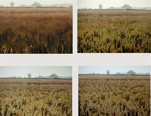
I wanted to paint a cornfield panorama facing the morning sun on one side and looking away on the other. There were very dramatic changes of light and colour across the field and I used digital photography to help me organise the colours.
I made oil studies of colours across 120 degrees. I also took photos with different exposures for different parts of the scene, short towards the sun, longest away, mimicking the adaption of my eye.
Oil study of bands of shifting colours in wheat as you look towards (left) and away (right) from the sun.
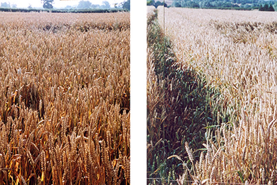
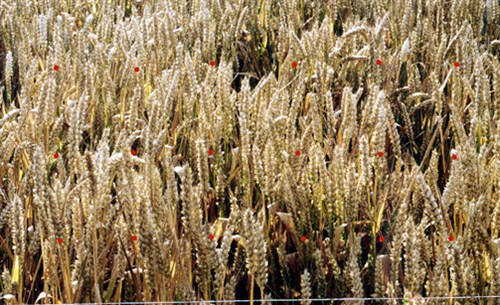
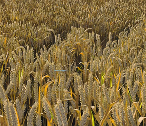
Example shots of different parts of the scene, left matches left of oil study, right right. For many reasons, the colour matches between painted studies and photos in this early experiment was imperfect. But if they were not good enough to usefully show all three dimensions of colour, they were good enough to suggest that tones could be mapped from the oil study to similar tones in the photos , and that this would still reveal much of the distribution of colours painted in the study.
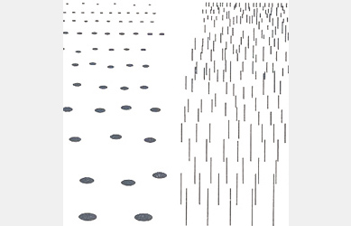
Analysing colour distributions in a digital image has been made easy by image processing software. I used an early edition of Adobe Photo Shop to pick colour that were closest to those in the oil studies. These were then displayed against plain background to make them easy to see.
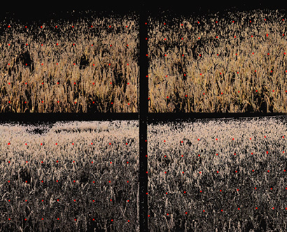
Above are two different colour selections from the same pair of photographs. I discovered that each colour made a texture and that each texture was subtly different. There seemed to be a natural association of colour with texture, and I started to think of selections as colour-textures.
It turns out that recent work in experimental psychology suggests the existence of a colour-texture association in the visual processing pathway.
references
I owe these to Professor John Mollon of Gonville and Caius College, Cambridge. John has a special interest in colour and the history of primate vision.
• Texture interactions determine perceived contrast. Charles Chubb, George Sperling, & Joshua A. Solomon Proc. Natl. Acad. Sci. USA Vol. 86, pp. 9631-9635, December 1989Contributed by George Sperling, August 24, 1989 *
• Color appearance depends on the variance of surround colors Richard O. Brown and Donald I.A. MacLeod. Published: 17 October 1997 Current Biology 1997, 7:844-849
2. Making colour textures in oil paint
My idea was to map each selection - already called 'layers' in the software - to a paint layer. This exploits a parallel between the basic building block of classical wet-on-dry oil technique and digital image processing. I have been developing this relationship in the studio, and now almost think in colour-textures. I also find it easier to see colour textures outdoors.
Examples of oil paint layers. This way of building up paintings is pre-impressionist. It's a wet on dry method that combines purity of individual colour mixes with a clear sense of individual paint marks.
3. Some differences between painting and photography
Compare a photographic source with a similar area in the painting below. Key differences between painting and photography emerge. The photograph has thousands of colours.We tend to make sense of this kind of scene by latching onto objects and groups of objects, and perhaps by noticing the illumination. But the scene is hard to see.
But the painting has a limited number of colours, distributed as colour-textures. This not only of makes the scene easier to see, but draws attention to the colours themselves. There is a mutually supportive interplay between the cognitive and the aesthetic. Put another way, we are made to feel we understand what we see through a sense of our own organisation of seeing - a deep pleasure of realist art.
Close to, we can see that each colour is a separate material mark and see the paint itself at work. The spectator can be involved with the medium. Further perceptual enhancement comes through a contrast of smooth, filmy areas and thick lumpy ones - a glaze/opaque paint contrast that is a classic resource of oil painting.
The workshop distinction between glaze and opaque paint exploits a perceivable distinction between what experimental psychologists sometimes call film and surface colour. (See Jacob Beck Surface Colour Perception. 1972). The power of these techniques derives from exploitation of features of visual processing: science and art feed the other.
This perceptual richness contributes to the intimacy of painting as a medium. And I think the intimacy and directness of painted images compared to machine made pictures matters a lot. It's now almost impossible to trust a digital image, but it's still very hard to fake a painting.
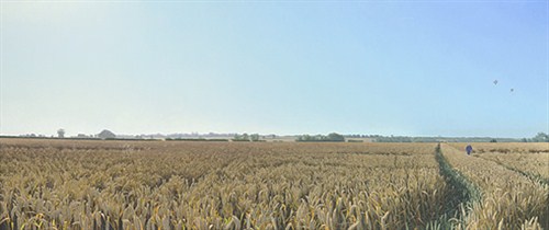
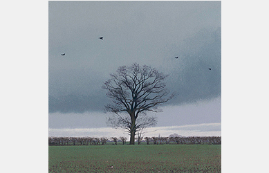
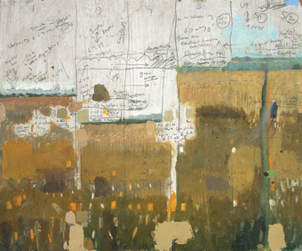
Final painting. The sun is directly above the oak tree to the left. For a zoom version click here.
Since writing this I am trying to bring this method of seeing to the apparently less colourful, more elusive subject of water
• Method first published in the catalogue for "Stephen Taylor, New Paintings" , May 2002, The Arts Center, King's College Cambridge. Edited by David Davies, one time editor of Nature.